How To Build A Responsive Hamburger Menu Using React And Tailwind CSS
This article is basically going to teach you how to build hamburger menu using Tailwind CSS while building a web app with React.

I am a frontend developer who's casually diving into writing. I am open to frontend roles and opportunities.
Introduction
I’ll be using the template of this Crappo landing page I completed recently, you can check it out here.
What we’ll be using/installing:
- Vitejs (to initialize a React web app template)
- Tailwind CSS (for the styling)
- Font Awesome v4.7 (for the hamburger menu and close button icons)
Please note that I’ll be referring to Tailwind CSS as TCSS from here till the end of this article.
Since this article is just to teach you about how to build a responsive hamburger menu, I’ll be using Vitejs to initialize a React app template instead of the traditional Create-React-App (C.R.A). You should really check out Vitejs, it’s very fast and light compared to CRA where you can finish cooking 2 bowls of uncooked beans before the installation is completed. 😝
Installations and set ups
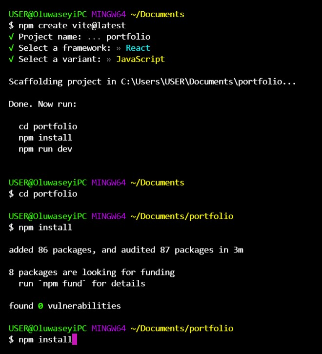
Below is an image of me initializing a React app template using Vitejs via CLI, it is very easy, just follow the instructions:
*Please note that you can use whatever styling methods of your choice e.g Vanilla CSS, CSS-in-JS, Styled Components, CSS modules and so on you want to use, just translate what I am doing to whatever it is that works best for you. If you’re not using TCSS, just skip this section and move to the next section.
After initializing a new React app template, install TCSS here by simply following the instructions and also doing necessary settings. I added my own custom TCSS settings as seen in the image and code blocks below. You should really try out TCSS if you haven’t yet.

/* index.css */

@import url("https://fonts.googleapis.com/css2?family=Kumbh+Sans:wght@100;200;300;400;500;600;700;800;900&display=swap");

@tailwind base;
@tailwind components;
@tailwind utilities;

@layer base {
  html {
    font-family: "Kumbh Sans", Tahoma, sans-serif;
  }

  body {
    margin: 0;
    padding: 0;
  }

  a {
    text-decoration: none;
  }

  li {
    list-style: none;
  }
}
// app.js

import React from "react";

const app = () => {
  return <p>Learning Hamburger with ReactJS and TailwindCSS</p>;
};

export default app;
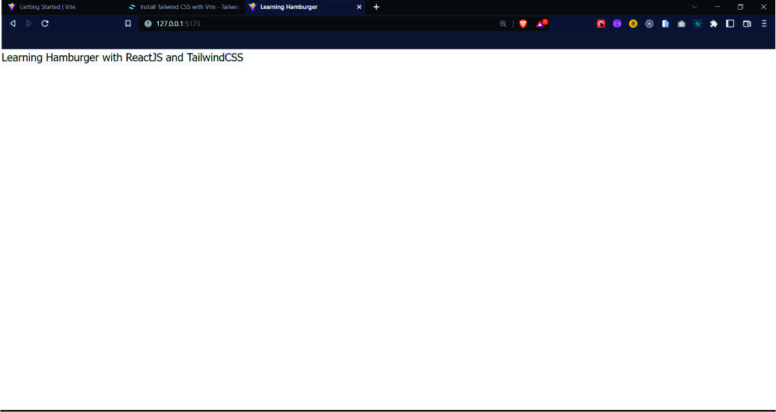
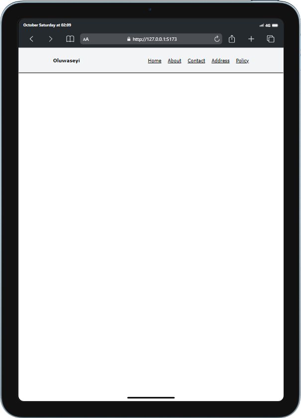
After all these set ups, this is what we should have on our screen now:
So thing is, there are actually many ways to build the hamburger menu while working with React, I am just going to teach you one of the many ways, and this time with TCSS. Don’t worry much if you don’t know TCSS because it’s actually the same as writing vanilla CSS, the only difference is that you’re going to be writing your CSS code inside your HTML element while you have to create a new CSS file to write vanilla CSS. There are also some instances too where you have to use a CSS file for Tailwind too like I did at the beginning of this article, I can’t go into details for that so just check out the docs here.
Cool! Now let’s continue.
Here we go!
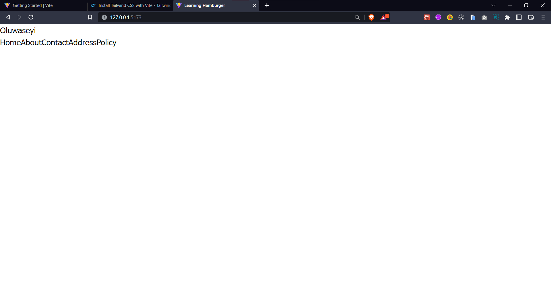
So like I said earlier, we’ll be using the template of the Crappo landing page I linked earlier. Since we’re only dealing with hamburger here, we’ll be working in only the app.js file/component. So let’s start by adding contents in a header element in our component. The contents will be a logo (text) and a list of links as seen below.
// app.js

import React from "react";

const App = () => {
  return (
    <>
      <header>
        <h1>Oluwaseyi</h1>
        <nav>
          <a href="#">Home</a>
          <a href="#">About</a>
          <a href="#">Contact</a>
          <a href="#">Address</a>
          <a href="#">Policy</a>
        </nav>
      </header>
    </>
  );
};

export default App;
Now let’s start styling our contents. Like I said earlier, TCSS is still the same CSS you write, just that you write it directly in your HTML file so if you don’t know TCSS, you should still be able to understand what I have done and then translate it to vanilla CSS or whatever CSS style you want to use. If you don’t understand anything, please let me know in the comments and I’ll try to respond to you ASAP.
// app.js

import React from "react";

const App = () => {
  return (
    <>
      <header className="bg-gray-100 flex justify-around items-center py-[25px] border-2 border-b-black ">
        <h1 className="font-bold">Oluwaseyi</h1>
        <nav className="flex gap-5 ">
          <a href="#" className="underline">Home</a>
          <a href="#" className="underline">About</a>
          <a href="#" className="underline">Contact</a>
          <a href="#" className="underline">Address</a>
          <a href="#" className="underline">Policy</a>
        </nav>
      </header>
    </>
  );
};

export default App;
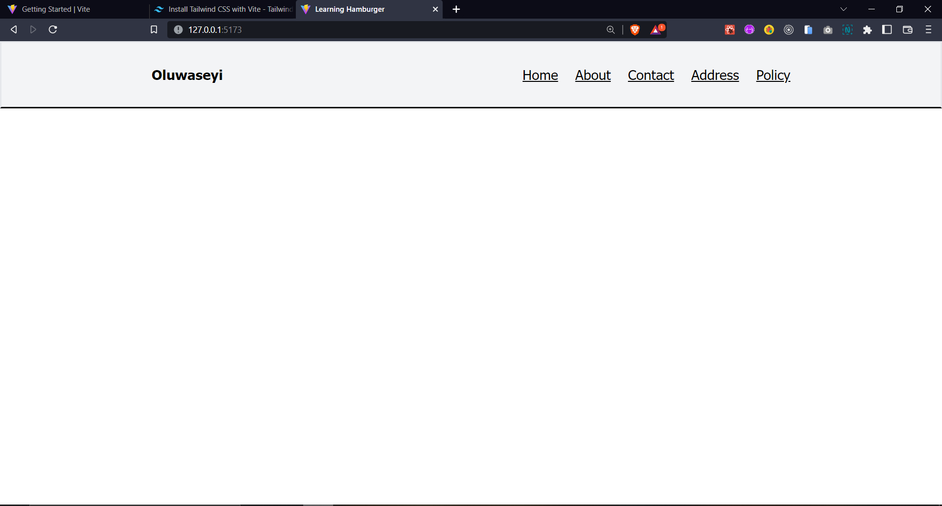
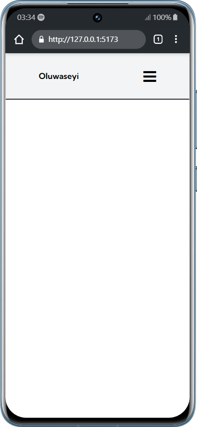
What I have basically done above is to make our header actually look like a navbar simply by implementing CSS flex and adding a background, I also added underline so we can see that they are links.
This is how a header is normally supposed to look like on large screens. While this stills look good on Tablet screens, it really looks abysmal on mobile device screens as seen below:
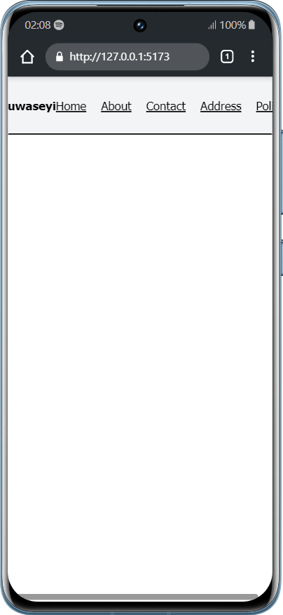
How do we combat this and make the navbar look good on mobile device? That’s exactly the purpose of this article.
Remember when I said there are many ways to build the hamburger menu while working with React and this is just one way I want to teach you, well that’s the section we are now.
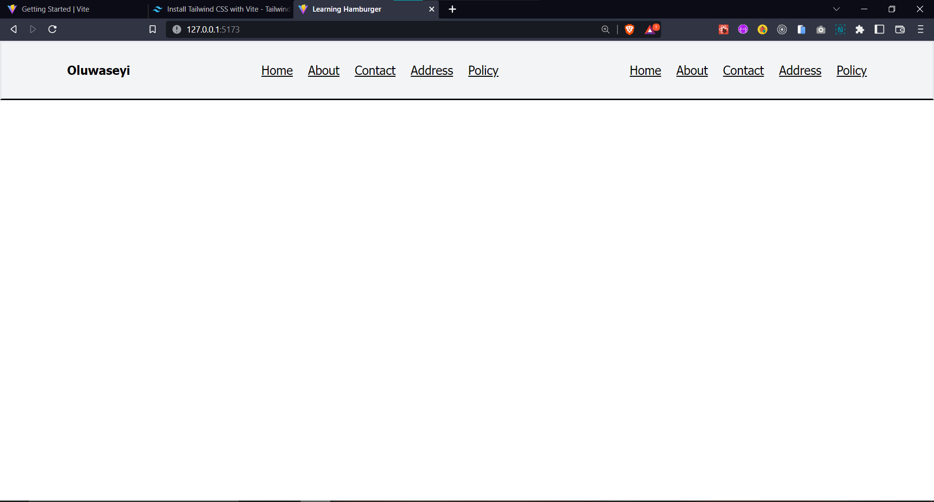
It is actually very simple. All we just have to do is to duplicate our nav element which has all the links in it which means we’ll now have two nav elements inside the header element. The code and result will look like this:
// app.js

import React from "react";

const App = () => {
  return (
    <>
      <header className="bg-gray-100 flex justify-around items-center py-[25px] border-2 border-b-black ">
        <h1 className="font-bold">Oluwaseyi</h1>

        {/* nav 1 */}
        <nav className="flex gap-5 ">
          <a href="#" className="underline">
            Home
          </a>
          <a href="#" className="underline">
            About
          </a>
          <a href="#" className="underline">
            Contact
          </a>
          <a href="#" className="underline">
            Address
          </a>
          <a href="#" className="underline">
            Policy
          </a>
        </nav>

        {/* nav 2 */}
        <nav className="flex gap-5 ">
          <a href="#" className="underline">
            Home
          </a>
          <a href="#" className="underline">
            About
          </a>
          <a href="#" className="underline">
            Contact
          </a>
          <a href="#" className="underline">
            Address
          </a>
          <a href="#" className="underline">
            Policy
          </a>
        </nav>
      </header>
    </>
  );
};

export default App;
Now to combat our problem, what we’re going to do next is to make the first nav element be for tablet screens and above while the second nav element be for only mobile device screens. What this means is that we’ll make the first nav element only be visible to tablet screen sizes and above while the second nav element will be visible for only mobile device screen sizes. What I will be working on now is the second nav element since the first nav element is also looking simple enough, I’ll make the styling as short as possible as we’re only learning here. You can add your own stylings if you want.
// app.js

import React from "react";

const App = () => {
  return (
    <>
      <header className="bg-gray-100 flex justify-around items-center py-[25px] border-2 border-b-black ">
        <h1 className="font-bold">Oluwaseyi</h1>

        {/* desktop nav */}
        <nav className="hidden md:flex gap-5 ">
          <a href="#" className="underline">
            Home
          </a>
          <a href="#" className="underline">
            About
          </a>
          <a href="#" className="underline">
            Contact
          </a>
          <a href="#" className="underline">
            Address
          </a>
          <a href="#" className="underline">
            Policy
          </a>
        </nav>

        {/* mobile nav */}
        <nav className="h-[100vh] fixed top-[0px] right-[0px] flex flex-col justify-around items-center w-full md:hidden bg-white z-40 duration-1000 ">
          <a href="#" className="underline">
            Home
          </a>
          <a href="#" className="underline">
            About
          </a>
          <a href="#" className="underline">
            Contact
          </a>
          <a href="#" className="underline">
            Address
          </a>
          <a href="#" className="underline">
            Policy
          </a>
        </nav>
      </header>
    </>
  );
};

export default App;

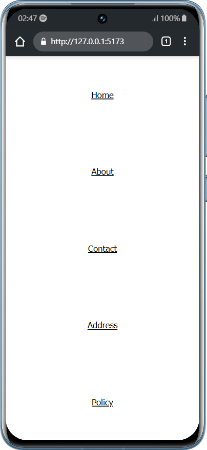
As you can see now, the TCSS code is very similar to the same way you write vanilla CSS(please let me know in the comments if you don’t understand anything) and the navbar is now looking different on mobile device screen while it’s the way it was before on tablet screen(and above).
Please note that md: in the code means 768px screen size and above. Thing is, TCSS already has 5 default media query breakpoints, although you can also change them to what you want manually. So what I just did is to make the desktop nav element available for screen sizes that are 768px and above while it’s hidden (also “display: none;”) on screen sizes that are 767px and below and it’s also vice versa for the mobile nav. Also note that “z-40” also means “z-index: 40;”.
Quick ad: If you’re learning one or two things here, don’t forget to follow me on twitter:
Now let’s make our mobile navbar functional and I’ll start by adding hamburger menu icon and also a close menu icon which I’ll take from Font Awesome 4.7. After adding an icon to my code, now is the time to use some React features.
I’ll start by importing the useState() hook. Then I’ll initialize a state named “nav” and give it a default value of false . We’ll then use this nav state to indicate whether to show the navbar/close menu icon(when the nav state is true) or only the logo and hamburger menu icon(when the nav state is false).
// app.js

import React, { useState } from "react";

const App = () => {
  const [nav, setNav] = useState(false);

  return (
    <>
      <header className="bg-gray-100 flex justify-around items-center py-[25px] border-2 border-b-black ">
        <h1 className="font-bold">Oluwaseyi</h1>

        {/* desktop nav */}
        <nav className="hidden md:flex gap-5 ">
          <a href="#" className="underline">
            Home
          </a>
          <a href="#" className="underline">
            About
          </a>
          <a href="#" className="underline">
            Contact
          </a>
          <a href="#" className="underline">
            Address
          </a>
          <a href="#" className="underline">
            Policy
          </a>
        </nav>

        {/* hamburger */}
        {nav ? (
          <i
            className="fixed right-[30px] fa fa-times text-3xl z-50 md:hidden"
            aria-hidden="true"
          ></i>
        ) : (
          <i className="fa fa-bars text-3xl md:hidden" aria-hidden="true"></i>
        )}

        {/* mobile nav */}
        <nav className="h-[100vh] fixed top-[0px] right-[0px] flex flex-col justify-around items-center w-full md:hidden bg-white z-40 duration-1000 ">
          <a href="#" className="underline">
            Home
          </a>
          <a href="#" className="underline">
            About
          </a>
          <a href="#" className="underline">
            Contact
          </a>
          <a href="#" className="underline">
            Address
          </a>
          <a href="#" className="underline">
            Policy
          </a>
        </nav>
      </header>
    </>
  );
};

export default App;
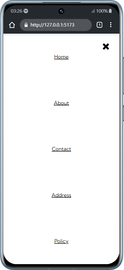
You can see the navbar and close menu icon are showing when nav is true and the logo and the hamburger are showing when nav is false. We’re almost getting there.
What is next now is making the hamburger menu icon and close menu icon become functional. And we simply just do that by creating a function named showNav(). Then we chain this function to a Javascript event listener called onClick={} which we’ll attach to both the hamburger icon and the close icon. What this function will do is that when any of the icons are clicked, it’ll always change the state of nav which is a Boolean to the opposite of the current Boolean.
// app.js

import React, { useState } from "react";

const App = () => {
  const [nav, setNav] = useState(false);

  const showNav = () => {
    setNav(!nav);
  };

  return (
    <>
      <header className="bg-gray-100 flex justify-around items-center py-[25px] border-2 border-b-black ">
        <h1 className="font-bold">Oluwaseyi</h1>
        {nav ? (
          // close button
          <i
            className="fixed right-[30px] fa fa-times text-3xl z-50 md:hidden"
            aria-hidden="true"
            onClick={showNav}
          ></i>
        ) : (
          <i
            className="fa fa-bars text-3xl md:hidden"
            aria-hidden="true"
            onClick={showNav}
          ></i>
        )}
And then lastly, we use the nav state to show and hide the navbar by using Ternary operator. Since we’ve changed the position of the navbar to fixed, what we just have to do now is to conditionally use the nav state to indicate if right should be equal to 0px(to show the navbar) or right should be equal to -100vw(to hide the navbar). The code below will make you understand what I am trying to explain:
        <nav
          className={`h-[100vh] fixed top-[0px] flex flex-col justify-around items-center w-full md:hidden bg-white z-40 duration-1000 ${
            nav ? "right-[0px]" : "right-[-100vw]"
          } `}
        >
          <a href="#" className="underline">
            Home
          </a>
          <a href="#" className="underline">
            About
          </a>
          <a href="#" className="underline">
            Contact
          </a>
          <a href="#" className="underline">
            Address
          </a>
          <a href="#" className="underline">
            Policy
          </a>
        </nav>
Annnnnnnndddd, we are done.
Final code and result:
Here's the final code:
// app.js

import React, { useState } from "react";

const App = () => {
  const [nav, setNav] = useState(false);

  const showNav = () => {
    setNav(!nav);
  };

  return (
    <>
      <header className="bg-gray-100 flex justify-around items-center py-[25px] border-2 border-b-black ">
        <h1 className="font-bold">Oluwaseyi</h1>

        {/* desktop nav */}
        <nav className="hidden md:flex gap-5 ">
          <a href="#" className="underline">
            Home
          </a>
          <a href="#" className="underline">
            About
          </a>
          <a href="#" className="underline">
            Contact
          </a>
          <a href="#" className="underline">
            Address
          </a>
          <a href="#" className="underline">
            Policy
          </a>
        </nav>

        {/* hamburger */}
        {nav ? (
          // close button
          <i
            className="fixed right-[30px] fa fa-times text-3xl z-50 md:hidden"
            aria-hidden="true"
            onClick={showNav}
          ></i>
        ) : (
          <i
            className="fa fa-bars text-3xl md:hidden"
            aria-hidden="true"
            onClick={showNav}
          ></i>
        )}

        {/* mobile nav */}
        <nav
          className={`h-[100vh] fixed top-[0px] flex flex-col justify-around items-center w-full md:hidden bg-white z-40 duration-1000 ${
            nav ? "right-[0px]" : "right-[-100vw]"
          } `}
        >
          <a href="#" className="underline">
            Home
          </a>
          <a href="#" className="underline">
            About
          </a>
          <a href="#" className="underline">
            Contact
          </a>
          <a href="#" className="underline">
            Address
          </a>
          <a href="#" className="underline">
            Policy
          </a>
        </nav>
      </header>
    </>
  );
};

export default App;
And result: %[https://youtu.be/3UbPpRz_rf8]
Conclusion:
Like I said earlier, this is just one of the many ways to build a hamburger menu. Please make a research on how to build a hamburger menu because there might be better ways to do it.
If you think there are any corrections that needs to be made in this article, please let me know in the comments and I'll review it and make corrections if needed.
Follow me on Twitter: @xoluwaseyi
This is my second ever article, incase you missed the first one, this is it here titled: Frontend Development roadmap by Oluwaseyi.
Thank you for reading and I hope you have learnt one or two things here! 😄
